Many people think product photography is a simple point-click-and-snap process. However, stellar product images (AKA Amazon images that lead to conversion) involve more complexity and technicality than a one-step process.
While an Amazon seller may think their at-home product photography is “passable,” their potential customers will not. Those customers have also been browsing through competitors’ listings, which may mean they may have been looking at hundreds of other options. They’ll take note of the difference in quality between the images. If a customer thinks a listing’s photos are subpar, they’ll buy from the listing with the more professional-looking images.
Amazon images that convert do so because the photographer chose the appropriate lens, determined the best lighting, and adjusted the aperture, shutter speed, and ISO combination to the proper settings. They considered other elements as well like reflections, focus, depth, color correction, white balance, and angles.
It takes work, but that doesn’t mean it’s impossible. Here are a few tips to get started.
If you want to know how to personally improve your Amazon images, Buy Box Experts can help with our FREE Amazon Listing Analysis. Our Amazon consultants will review your images and tell you exactly what needs to be done to increase conversion.
1. Maintain Consistency
A seller can upload up to nine images on Amazon. There is only one main image, but there can be multiple lifestyle images, infographics, and other secondary images, like angle shots.
To fully optimize a listing, images shot in the same setting should maintain consistent lighting and use similar camera settings.
Here are three different photos of the same product. While each photo is good by itself, the three images create inconsistency when featured on the same listing.

The drastic difference in lighting and coloration may have customers questioning if the product is light brown, yellow, or beige. Consistent photography reduces questions from customers. Additionally, customer complaints and negative reviews can be reduced by correcting the photos to accurately present the color and size of the product.
2. Control Reflections
Reflections will make or break an image. When used appropriately, reflections can highlight the quality of a product, especially if the product is bottled in glass.

Notice the difference between these two photos of a high-end olive oil. The first photo makes the olive oil appear murky and dull because there are no reflections. The second photo shows the olive oil with reflections. It appears brighter, clearer, and of greater quality.
As seen above, reflections can make a product more flattering, but they should be removed from an image if they reveal anything in the background (like camera equipment). Additionally, remove reflections if they obscure text on the product.
3. Get Rid of Dust, Wrinkles, and Scratches
Dust, wrinkles, and scratches can make a product look cheap. This is particularly true for small items that need to be captured up-close. The closer the camera is to the product, the more visible dust, wrinkles, and scratches will be. Make sure to remove them with a photo editor.
Need help with your listing? Buy Box Experts offers a FREE Amazon Listing Analysis. Our Amazon consultants will help you find opportunities to improve your listing, enhance conversion, and increase your sales!
4. Nail the Main Image
The main image is often a customer’s first impression of a brand or product. If it’s not professional or high-quality, customers will move onto a competitor’s product instead.
The main image can also affect the listing’s standing. If it doesn’t follow Amazon’s guidelines, Amazon can suppress the listing or, at the very least, replace the image. For product photography in the main image, Amazon states that the product must take up at least 85% of the space, be unpackaged, and photographed under studio lighting. Amazon also mentions that main images must not have text, inlay images, props, or graphic design elements and that they should have a pure white background.
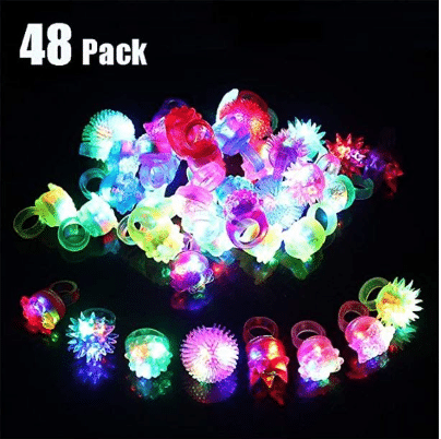
However, some sellers bend these rules because they believe straying from Amazon’s guidelines proves more beneficial for the customer. Take the picture below for example:

The black background emphasizes the colorful lights while the “48-pack” text lets consumers immediately know how many light-up rings are in a bag. With these extra elements, shoppers can readily make an informed purchase decision.
It’s unclear when Amazon allows these exceptions. Sometimes, they accept the deviations, and other times, Amazon suppresses them. A good rule of thumb is to survey the competitive landscape. Take note of what industry leaders are doing in each category then follow their example.
Great Amazon Images Lead to Greater Conversion
Product images are crucial to increasing your number of sales. The above photography tips can help any Amazon seller optimize their listing. Additionally, this blog post, Optimizing Photos and Infographics for Amazon, is another great resource for photo optimization. Sellers looking for more ways to enhance their images should request a free Amazon Listing Analysis from Buy Box Experts. Our seasoned consultants have hands-on experience in what works and what doesn’t on Amazon. Schedule today! Just click below.

If you’re one of the estimated 20%–40% of brands who fire their agency annually, you can’t focus on that vision if you have to keep searching for the right support. BBE proudly retained >95% of our clients last year while applying focused dedication to our brand partners. If you’re ready to start over for the last time, contact us and find out why leading brands have partnered with us for so long.

